
Write captions and help
Use display to turn internal column names into language your labelers understand. It changes the screen, not the CSV headers or stored answer values.
Caption, instruction, and help
Section titled “Caption, instruction, and help”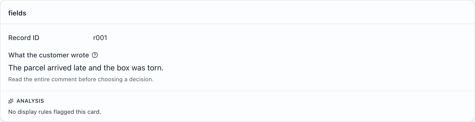
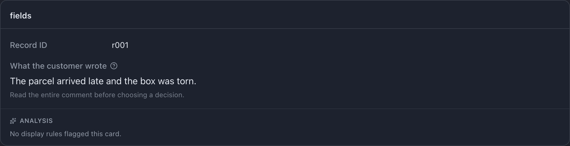
The comment input field uses:
{ "name": "comment", "type": "text", "display": { "title": "What the customer wrote", "description": "Read the entire comment before choosing a decision.", "help": "Judge the delivery experience, not the writing style. If the evidence is incomplete, follow your project guidelines.", "titlePosition": "above", "textSize": "lg", },}Try this example: download the complete configuration and sample CSV. Open the configuration in MLabel, then load the CSV.
View the complete configuration
{ "$schema": "https://mlabel.vlad.gg/mlabel.schema.json", "version": 2, "network": { "updateChecks": false, }, "input": { "fields": [ { "name": "id", "type": "text", "display": "Record ID", }, { "name": "comment", "type": "text", "display": { "title": "What the customer wrote", "description": "Read the entire comment before choosing a decision.", "help": "Judge the delivery experience, not the writing style. If the evidence is incomplete, follow your project guidelines.", "titlePosition": "above", "textSize": "lg", }, }, ], }, "output": { "fields": [ { "name": "id", "type": "text", "fill": { "kind": "copy", }, }, { "name": "verdict", "type": "enum", "widget": "radio", "display": "Review decision", "choices": [ { "name": "pass", "display": "Pass", }, { "name": "fail", "display": "Fail", "selectedStyle": { "tone": "danger", }, }, ], }, ], },}View the sample CSV
id,commentr001,The parcel arrived late and the box was torn.The shorthand
Section titled “The shorthand”For a title alone, use a string: "display": "Customer comment". It means the same as "display": { "title": "Customer comment" }.
Without a title, MLabel uses the field’s name. Set a friendly title when names such as delivery_score_v2 would be confusing.
The keys
Section titled “The keys”| Setting | Use it for | Available on |
|---|---|---|
title |
A short caption or heading | Fields, cards, choices, table columns |
description |
A short instruction shown with the content where supported | Display objects |
help |
Guidance opened with the question-mark button where supported | Display objects |
titlePosition |
above for long source values; left for compact source facts |
Fields |
textSize |
sm, md, or lg for source values |
Fields |
The source view uses caption placement and text size. Answer controls have their own layouts; a radio group or text box is not laid out like a read-only source field. Card descriptions and help are visible on source cards; answer-group and setup-group headings use the card title.
Layout for long values
Section titled “Layout for long values”Set titlePosition: "above" for paragraphs so the caption does not take width away from the text. textSize: "lg" can help emphasize the main passage. Leave short metadata at the default size.
Description or help?
Section titled “Description or help?”Use description for an instruction everyone needs on every record. Use help for definitions, edge cases, or a longer example.
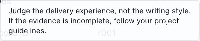
Keep both practical: “Choose every delivery issue mentioned” is more useful than repeating the field’s name. Explain what an answer means without telling labelers which judgment to make.
Styling a selected choice
Section titled “Styling a selected choice”A choice can use selectedStyle to add a tone when selected:
[ { "name": "pass", "display": "Pass", }, { "name": "fail", "display": "Fail", "selectedStyle": { "tone": "danger", }, },]

Use color to reinforce a meaning already stated in words. See all six tones.
The window title
Section titled “The window title”Use "ui": { "appTitle": "Delivery review" } for a fixed title, or "ui": { "appTitle": { "field": "id" } } to show the current record’s input ID.